Card carousel
A horizontal, swipeable strip of related cards.
What it is
A card carousel shows a set of related cards in a horizontal, swipeable strip with previous and next controls. It is the grid block set to the Carousel display: the same cards, shown one screenful at a time instead of wrapped into rows. Use it for a scannable run of latest items where horizontal browsing suits the content.
- Card carousel(opens in new window)
How to add it
Add a Grid block, choose Card as the item type, then set Display to Carousel. Style the cards — colour, elements, image position — exactly as on the Cards page; those options aren’t repeated here. Under Carousel options, turn on any combination of:
- Drag / swipe — visitors drag or swipe sideways through the cards.
- Pagination — dot indicators show how many pages there are and let people jump between them.
- Loop (continuous) — the cards scroll on continuously and wrap around; it pauses on hover so it stays readable.
- Counter — shows “1 / 5” with the arrows under the cards instead of a header. The heading isn’t shown, but it still names the carousel for screen readers.
- View more link — adds a “view more” link in the carousel header (set its URL).
Give the carousel a heading (the visible title), and optionally an accessible label — the screen-reader name for the carousel, if it should read differently from the heading.
Configure it
Tips
Related pages
Example
Drag and swipe
Carousel items
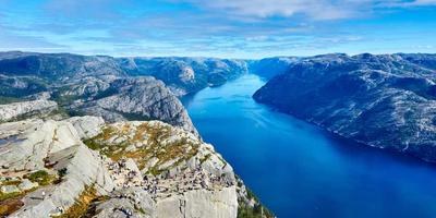
The annual awards will recognise individuals and organisations for their leadership , commitment and innovation in sustainability across NSW.
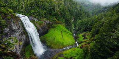
The NSW Government will create more quality green spaces and increase ther tree canopy in Sydney bt 2022.
The NSW Government will redouble its efforts to lift literacy and numeracy standards across NSW public schools to ensure students are given every opportunity to be their best.
The annual awards will recognise individuals and organisations for their leadership , commitment and innovation in sustainability across NSW.
The NSW Government will create more quality green spaces and increase ther tree canopy in Sydney bt 2022.
Latest news
Pagination
Carousel items
The annual awards will recognise individuals and organisations for their leadership , commitment and innovation in sustainability across NSW.
The NSW Government will create more quality green spaces and increase ther tree canopy in Sydney bt 2022.
The NSW Government will redouble its efforts to lift literacy and numeracy standards across NSW public schools to ensure students are given every opportunity to be their best.
The annual awards will recognise individuals and organisations for their leadership , commitment and innovation in sustainability across NSW.
The NSW Government will create more quality green spaces and increase ther tree canopy in Sydney bt 2022.
The NSW Government will redouble its efforts to lift literacy and numeracy standards across NSW public schools to ensure students are given every opportunity to be their best.
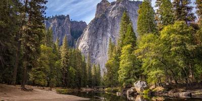
The annual awards will recognise individuals and organisations for their leadership , commitment and innovation in sustainability across NSW.
The NSW Government will create more quality green spaces and increase ther tree canopy in Sydney bt 2022.
The NSW Government will redouble its efforts to lift literacy and numeracy standards across NSW public schools to ensure students are given every opportunity to be their best.
Latest news
Pagination with a view more link
Carousel items
The annual awards will recognise individuals and organisations for their leadership , commitment and innovation in sustainability across NSW.
The NSW Government will create more quality green spaces and increase ther tree canopy in Sydney bt 2022.
The NSW Government will redouble its efforts to lift literacy and numeracy standards across NSW public schools to ensure students are given every opportunity to be their best.
The annual awards will recognise individuals and organisations for their leadership , commitment and innovation in sustainability across NSW.
The NSW Government will create more quality green spaces and increase ther tree canopy in Sydney bt 2022.
The NSW Government will redouble its efforts to lift literacy and numeracy standards across NSW public schools to ensure students are given every opportunity to be their best.
The annual awards will recognise individuals and organisations for their leadership , commitment and innovation in sustainability across NSW.
The NSW Government will create more quality green spaces and increase ther tree canopy in Sydney bt 2022.
The NSW Government will redouble its efforts to lift literacy and numeracy standards across NSW public schools to ensure students are given every opportunity to be their best.
Latest news
Counter
Carousel items
The annual awards will recognise individuals and organisations for their leadership , commitment and innovation in sustainability across NSW.
The NSW Government will create more quality green spaces and increase ther tree canopy in Sydney bt 2022.
The NSW Government will redouble its efforts to lift literacy and numeracy standards across NSW public schools to ensure students are given every opportunity to be their best.
The annual awards will recognise individuals and organisations for their leadership , commitment and innovation in sustainability across NSW.
The NSW Government will create more quality green spaces and increase ther tree canopy in Sydney bt 2022.
/